Hover Image
A stunning hover-based image preview component. When users hover over project titles, a smooth mouse-following thumbnail appears showcasing the corresponding image. Perfect for portfolios, project showcases, and creative agency websites.
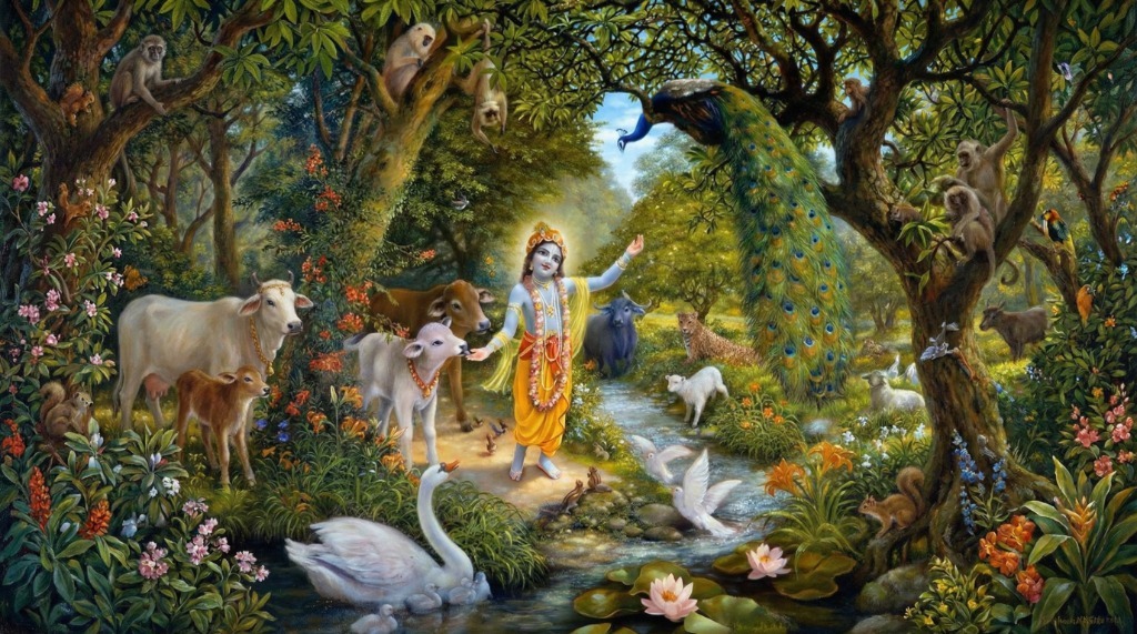
Shree Krishna
The Supreme Personality of Godhead
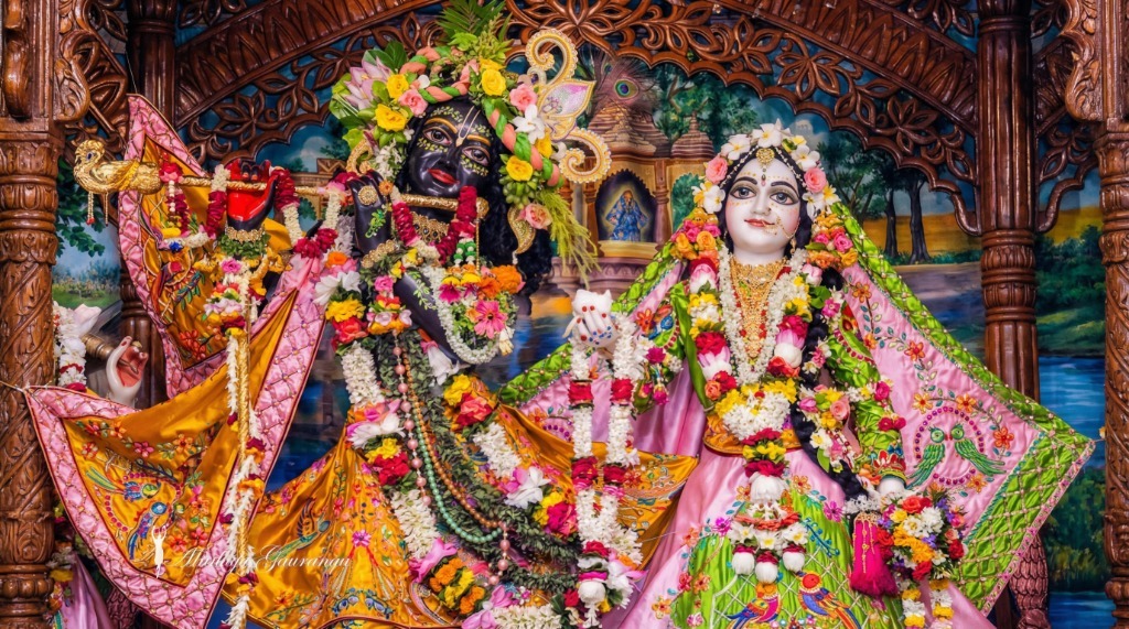
Radha Krishna
The Divine Couple
Divine Love
Eternal Bond

Install using CLI
npx shadcn@latest add "https://obsidianui.dev/r/hover-img.json"Install Manually
1
Install dependencies
2
Copy the source code
Copy into components/ui/hover-img.tsx
"use client";

import React, { useRef, useEffect } from "react";
import gsap from "gsap";
import "./hover-img.css";

interface ProjectItem {
    title: string;
    label: string;
    imageSrc: string;
}

const defaultProjects: ProjectItem[] = [
    {
        title: "Shree Krishna",
        label: "The Supreme Personality of Godhead",
        imageSrc: "/hover-img/image-1.jpg",
    },
    {
        title: "Radha Krishna",
        label: "The Divine Couple",
        imageSrc: "/hover-img/image-2.jpg",
    },
    {
        title: "Divine Love",
        label: "Eternal Bond",
        imageSrc: "/hover-img/image-3.jpg",
    },
];

interface HoverImgProps {
    projects?: ProjectItem[];
    className?: string;
}

export function HoverImg({ projects = defaultProjects, className }: HoverImgProps) {
    const containerRef = useRef<HTMLDivElement>(null);
    const thumbnailRef = useRef<HTMLDivElement>(null);
    const xToRef = useRef<gsap.QuickToFunc | null>(null);
    const yToRef = useRef<gsap.QuickToFunc | null>(null);

    useEffect(() => {
        const projectThumbnail = thumbnailRef.current;
        const projectsContainer = containerRef.current?.querySelector(
            ".hover-img-projects"
        ) as HTMLElement | null;

        if (!projectThumbnail || !projectsContainer) return;

        const projectElements = gsap.utils.toArray(
            ".hover-img-project",
            projectsContainer
        ) as HTMLElement[];
        const thumbnails = gsap.utils.toArray(
            ".hover-img-thumbnail",
            projectThumbnail
        ) as HTMLElement[];

        gsap.set(projectThumbnail, { scale: 0, xPercent: -50, yPercent: -50 });

        xToRef.current = gsap.quickTo(projectThumbnail, "x", {
            duration: 0.4,
            ease: "power3.out",
        });
        yToRef.current = gsap.quickTo(projectThumbnail, "y", {
            duration: 0.4,
            ease: "power3.out",
        });

        const handleMouseMove = (e: MouseEvent) => {
            xToRef.current?.(e.clientX);
            yToRef.current?.(e.clientY);
        };

        const handleMouseLeave = () => {
            gsap.to(projectThumbnail, {
                scale: 0,
                duration: 0.3,
                ease: "power2.out",
                overwrite: "auto",
            });
        };

        projectsContainer.addEventListener("mousemove", handleMouseMove);
        projectsContainer.addEventListener("mouseleave", handleMouseLeave);

        const projectListeners: Array<() => void> = [];

        projectElements.forEach((project, index) => {
            const handleMouseEnter = () => {
                gsap.to(projectThumbnail, {
                    scale: 1,
                    duration: 0.4,
                    ease: "power2.out",
                    overwrite: "auto",
                });

                gsap.to(thumbnails, {
                    yPercent: -100 * index,
                    duration: 0.4,
                    ease: "power2.out",
                    overwrite: "auto",
                });
            };

            project.addEventListener("mouseenter", handleMouseEnter);
            projectListeners.push(() =>
                project.removeEventListener("mouseenter", handleMouseEnter)
            );
        });

        return () => {
            projectsContainer.removeEventListener("mousemove", handleMouseMove);
            projectsContainer.removeEventListener("mouseleave", handleMouseLeave);
            projectListeners.forEach((cleanup) => cleanup());
        };
    }, [projects]);

    return (
        <div className={`hover-img-container ${className || ""}`} ref={containerRef}>
            <div className="hover-img-projects">
                {projects.map((project, index) => (
                    <div className="hover-img-project" key={index}>
                        <h2>{project.title}</h2>
                        <p>{project.label}</p>
                    </div>
                ))}
            </div>

            <div className="hover-img-thumbnail-wrapper" ref={thumbnailRef}>
                {projects.map((project, index) => (
                    <div className="hover-img-thumbnail" key={index}>
                        <img src={project.imageSrc} alt={project.title} />
                    </div>
                ))}
            </div>
        </div>
    );
}

export default HoverImg;3
Add the CSS file
Copy into components/ui/hover-img.css
.hover-img-container {
  --hi-bg: #f8f8f8;
  --hi-text: #0a0a0a;
  --hi-border: rgba(0, 0, 0, 0.12);

  font-family: "Inter", "system-ui", sans-serif;
  min-height: 60vh;
  width: 100%;
  background: var(--hi-bg);
  color: var(--hi-text);
  display: flex;
  flex-direction: column;
  align-items: center;
  justify-content: center;
  position: relative;
  border-radius: 1rem;
  overflow: hidden;
}

/* Dark mode support */
.dark .hover-img-container {
  --hi-bg: #0a0a0a;
  --hi-text: #fafafa;
  --hi-border: rgba(255, 255, 255, 0.15);
}

.hover-img-projects {
  display: flex;
  flex-direction: column;
  width: 100%;
  max-width: 900px;
  padding: 2rem;
}

.hover-img-project {
  width: 100%;
  display: flex;
  align-items: center;
  justify-content: space-between;
  padding: 2rem 3rem;
  border-top: 1px solid var(--hi-border);
  cursor: pointer;
  transition: opacity 0.3s ease;
}

.hover-img-project:last-child {
  border-bottom: 1px solid var(--hi-border);
}

.hover-img-project h2 {
  font-size: 2.5rem;
  font-weight: 600;
  letter-spacing: -0.02em;
  transition: transform 0.4s cubic-bezier(0.4, 0, 0.2, 1);
  margin: 0;
}

.hover-img-project p {
  font-size: 1rem;
  font-weight: 400;
  opacity: 0.6;
  transition: transform 0.4s cubic-bezier(0.4, 0, 0.2, 1);
  margin: 0;
}

.hover-img-project:hover {
  opacity: 0.6;
}

.hover-img-project:hover h2 {
  transform: translateX(-12px);
}

.hover-img-project:hover p {
  transform: translateX(12px);
}

.hover-img-thumbnail-wrapper {
  position: fixed;
  width: 350px;
  height: 220px;
  display: flex;
  flex-direction: column;
  overflow: hidden;
  pointer-events: none;
  top: 0;
  left: 0;
  transform-origin: center center;
  z-index: 100;
  border-radius: 12px;
  box-shadow: 0 25px 50px -12px rgba(0, 0, 0, 0.25);
}

.hover-img-thumbnail {
  width: 100%;
  height: 100%;
  flex-shrink: 0;
}

.hover-img-thumbnail img {
  width: 100%;
  height: 100%;
  object-fit: cover;
}Props
| Prop Name | Type | Default | Description |
|---|---|---|---|
| projects | ProjectItem[] | Default projects | Array of project items with title, label, and imageSrc |
| className | string | - | Additional CSS classes for the container |
ProjectItem Type
interface ProjectItem {
    title: string;    // Project title displayed on hover
    label: string;    // Subtitle/category label
    imageSrc: string; // URL to the project image
}